Loading...

T4SG × 2ft Prosthetics

When Inventory Fails, People Wait

A UX case study on designing an offline-first system for global prosthetics care.

Role: UX Designer
My scope: Add / Edit / View Component
Research: President + Treasurer + 3 Volunteers
Constraint: Build from Scratch + Unreliable internet
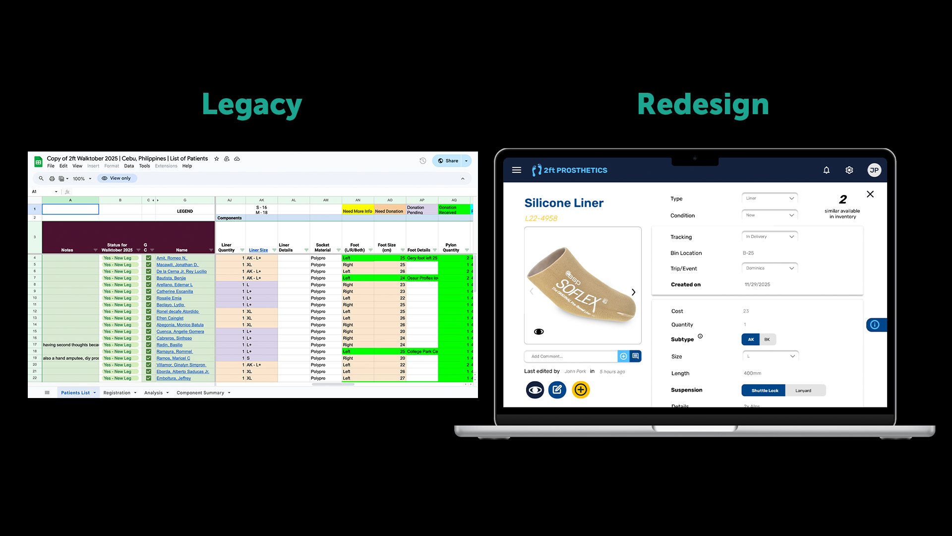
2ft inventory system preview

TL;DR

• One prosthetic fitting requires 9+ components. One missing part means the patient goes home without a leg.

• 2ft’s inventory lived across spreadsheets and manual cross-checks, which can be fragile under turnover and low Wi-Fi.

• We designed an offline-first system with clear logistics vs technical separation and low cognitive load.

Context

A Prosthetic Is Never Just One Thing

A prosthetic leg isn’t a single object — it’s a system. On average, nine separate components must come together for one fitting. If even one part is missing, delayed, or mislabeled, a patient goes home without a leg.

2ft Prosthetics works across 10 countries, redistributing donated prosthetic components from U.S. manufacturers and clinics to underserved amputees worldwide. The work is powered largely by volunteers — students, clinicians, and prosthetists — operating across time zones, languages, and unreliable internet access.

As the organization scaled, one quiet truth emerged:
The hardest part wasn’t getting donations. It was keeping track of them.

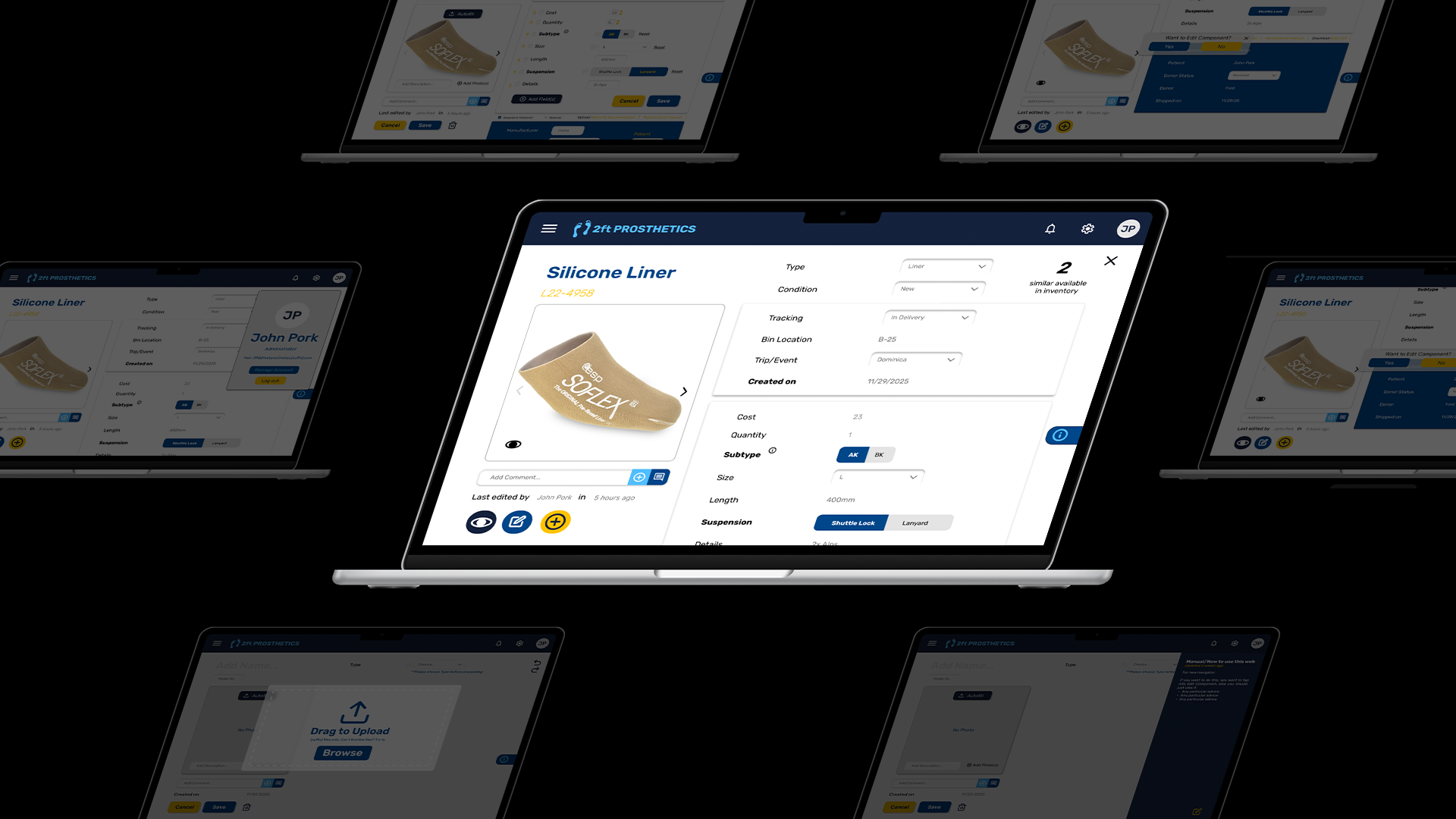
2ft inventory system preview

The Current Problem

Good Intentions, Fragile Systems

Inventory at 2ft Prosthetics lived in spreadsheets, Notion pages, and manual cross-checks. On paper, everything existed. In reality, volunteers struggled to answer basic questions:

— What do we actually have right now?
— Where is this component stored?
— Has it shipped? Has it been fitted?
— Who donated this — and how do we report impact back?

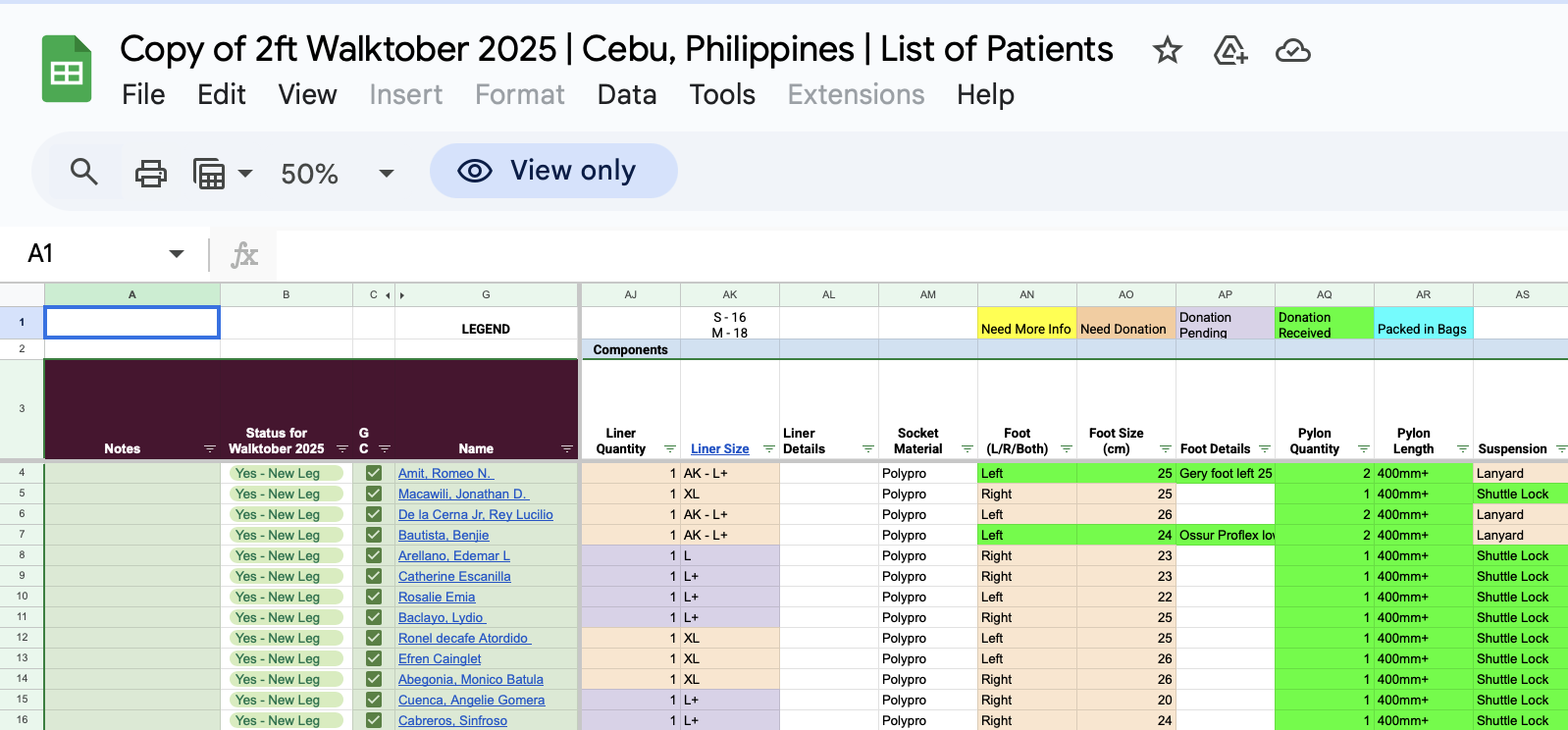
Placeholder: Spreadsheet General inventory view
Placeholder: Keep track
Placeholder: Summary of Requested Components

Placeholder content in Real Template 2feet Prosthetics is currently using

Research

Listening Closely to the People Holding It Together

We conducted interviews with the 2ft Prosthetics President, Treasurer, and three volunteers who manage inventory updates in real conditions. Instead of hypotheticals, we focused on real workflows:

— Screen-shared walkthroughs of current spreadsheets
— How updates happen under time pressure
— Where mistakes, duplication, or confusion creep in
— What happens when Wi-Fi disappears

We also ran a competitive analysis across existing inventory tools (Airtable, Sortly, Notion, Odoo, etc.).

Interview Highlights

President Inventory

“The same part exists in three different places.”

Inventory lives across multiple spreadsheets, tabs, and naming conventions, making it hard to know whether a component is available, used, or misplaced.

Design implication: one canonical inventory source with consistent component IDs and clear status states (in storage, on trip, fitted, returned).

President Labeling

“You have to already know the system to use it.”

Status labels and categories are inconsistent, undocumented, and difficult for new volunteers to understand without direct guidance.

Design implication: standardized terminology, inline definitions, and guardrails that prevent mislabeling during data entry.

President Operations

“I just want to know what we have right now.”

There is no reliable real-time snapshot of inventory — checking availability means digging through spreadsheets and asking people directly.

Design implication: a default dashboard showing current inventory counts with last-updated timestamps and editor attribution.

Volunteer Offline

“I usually write it down and update it later.”

Clinics, travel days, and storage sites often lack reliable internet, forcing volunteers to track parts on paper or in personal notes.

Design implication: offline-first data entry with visible sync states and safe conflict resolution when reconnecting.

Volunteer Edit anxiety

“I’m worried I’ll mess something up.”

Volunteers hesitate to update records because it’s unclear who edited what last, or whether changes can be undone.

Design implication: edit history, change previews, and clear save confirmation to support confident collaboration.

Volunteer Navigation

“I never know where to look.”

Information is spread across tabs and columns with no clear hierarchy, making even simple lookups slow.

Design implication: task-oriented navigation (search, add, move, review) instead of spreadsheet-style layouts.

Treasurer Reporting

“We rebuild reports every year.”

Donor and inventory reports are assembled manually because fields aren’t consistent or comparable across years.

Design implication: normalized donor fields, timestamps, and export-ready reports for year-over-year comparison.

Treasurer Accountability

“I don’t directly manage inventory — but I’m responsible for it.”

Components represent real financial value, yet inventory tracking doesn’t clearly support auditing or accountability.

Design implication: traceability from donor → component → usage to support financial oversight without extra manual work.

The real bottleneck
Updating is harder than tracking
The default environment
Internet is unreliable (or absent)
The trust requirement
“Who changed this?” must be obvious

What we learned quickly

Most existing tools failed in the same ways: assumed stable internet, visual density overload, unclear separation between logistics and technical data, and a steep learning curve for new volunteers.

Design Goals

What We Optimized For (and What We Didn’t)

— Clarity over completeness
— Fast entry over perfect data
— Offline-first by default
— Low cognitive load for new volunteers
— Traceability without visual overload

Impact vs effort matrix

Ideation

Feature decisions by Impact × Effort

We prioritized what would reduce uncertainty the fastest. Using an impact × effort map, we shipped “low-hanging fruit” first, then layered in more powerful features once the core flows worked.

This kept the product usable for new volunteers while still leaving space for advanced functionality as 2ft scales.

“We started with clarity + offline reliability, then added power features later.”

Feature rollout (how it evolved)

Phase 1: Core Inventory Reliability (simple viewing, terminology, edit component).

Phase 2: Deeper Traceability (edit history, comments, richer categorization).

Phase 3: Scalability Features (add component flow, filters, helpers).

My Contribution

View / Edit / Add Component Flow

I owned the end-to-end flow for how a volunteer views a component, makes a safe edit, and adds a new component without breaking traceability.

Design decisions I focused on:
— Keep primary actions always accessible (view history / edit / add)
— Prevent accidental edits (inline popups, clear save states)
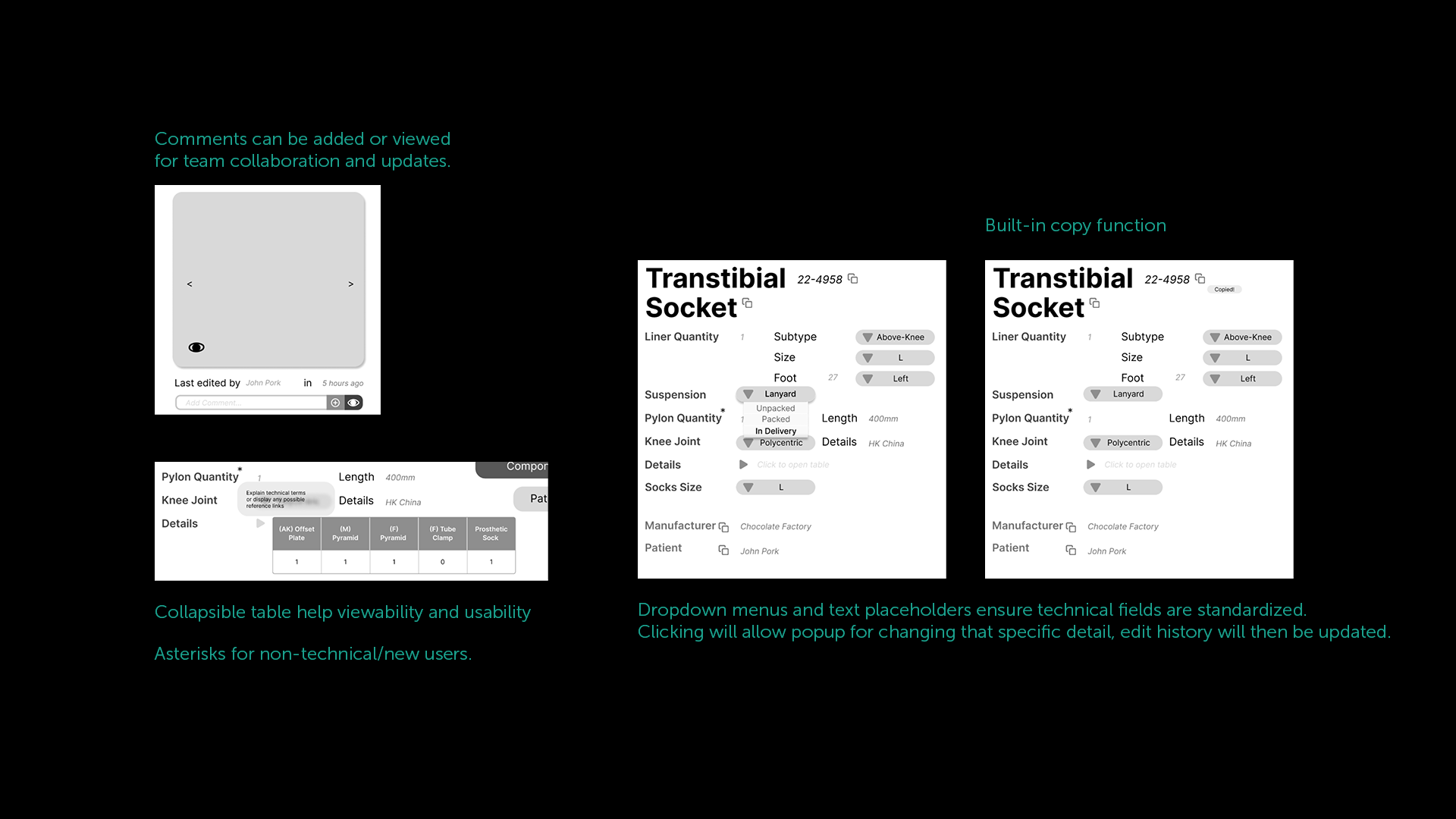
— Standardize technical inputs (dropdowns + placeholders, not free text)
— Make accountability visible (edit history + who/when)

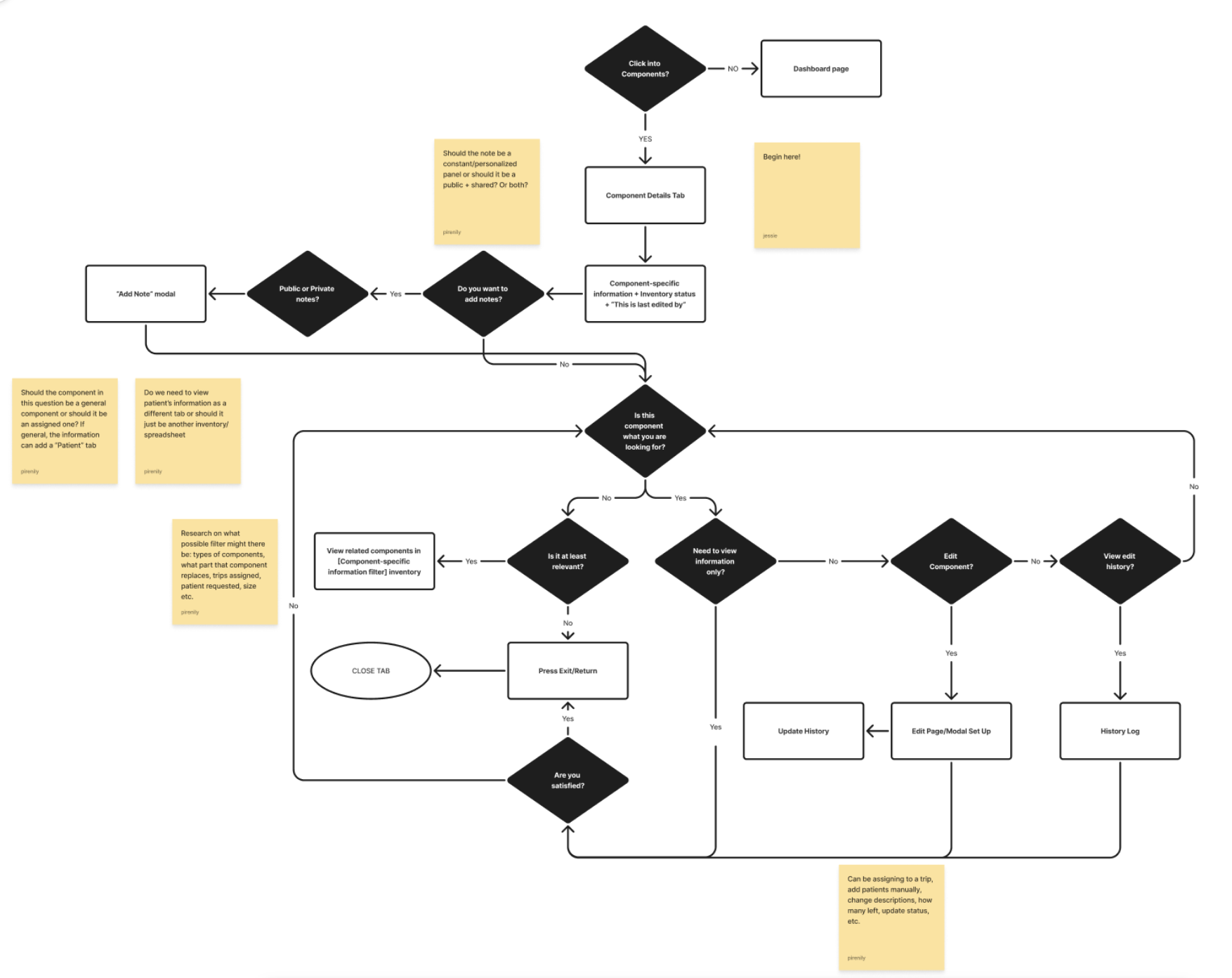
User flow: View Component

Flow Breakdown

View Component

The component page is structured so volunteers understand the “state” first (logistics), then drill into technical details only when needed. Collapsible sections reduce overload.

Clear Flow Needed: 4 distinct areas of information are central to a cognitive flow: sticky profile, logistics→technical→manufacturer.

Lo-Fi Prototyping

Stripping It Down Until It Made Sense

Placeholder: Lo-fi Ideation

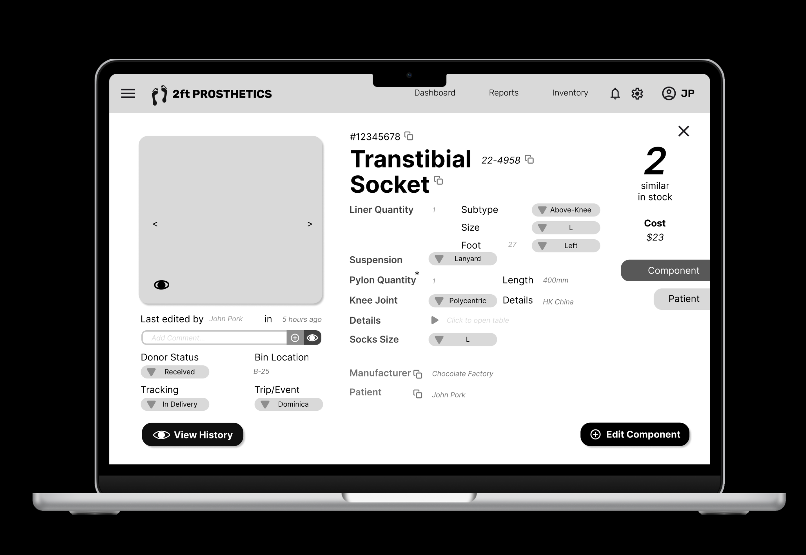
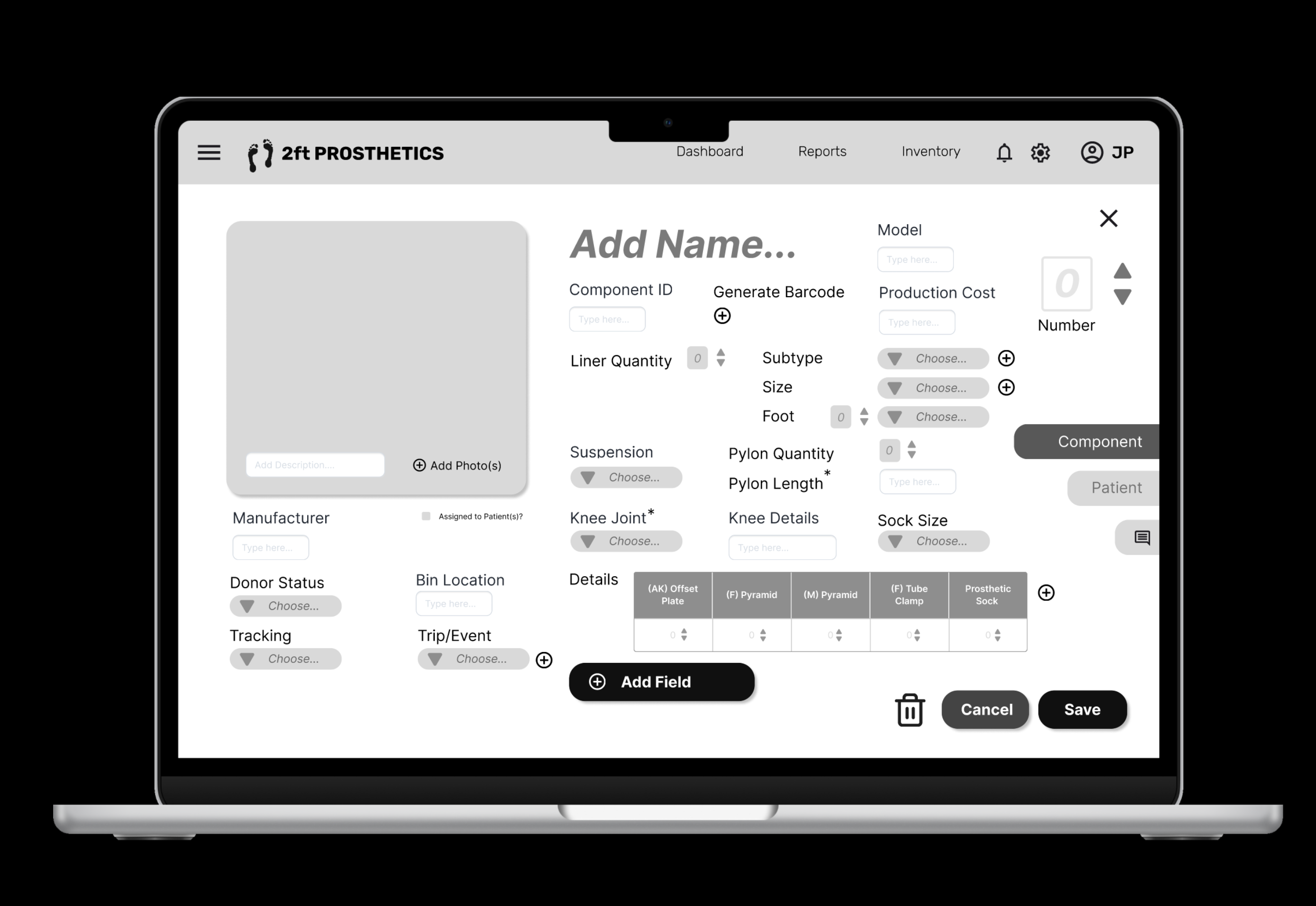
The black & white prototypes focused purely on information hierarchy, navigation clarity, and reducing visual density. If a field didn’t earn its place, it was removed.

Placeholder: Lo-fi view component screen (B&W) Placeholder: Lo-fi add component flow (B&W)

What we learned, what we changed, and why it worked

Lo-fi helped us prove the hierarchy. But once stakeholders interacted with it, the feedback wasn’t about visual design — it was about speed, trust, and reducing “I might break something” anxiety.

What wasn’t working

• There is a hierarchy of information that wasn’t clearly represented

• Too many fields visible at once

• Edits felt risky (no clear confirmation )

• Logistics + technical details blended together

• Patient-centered categorization makes components' relationship complex

What changed (Hi-Fi)

• Collapsible sections → reveal complexity only when needed

• Clear save states → safer changes

• Stronger separation: Logistics → Technical → Manufacturer

• Dropdowns + defaults + helper text → less typing, fewer errors

• Flow of work in Add Components established more properly

Designer note: The goal wasn’t to add UI polish but to make the same work feel lighter and more reliable.

Hi-Fi Design

Making Complexity Feel Calm

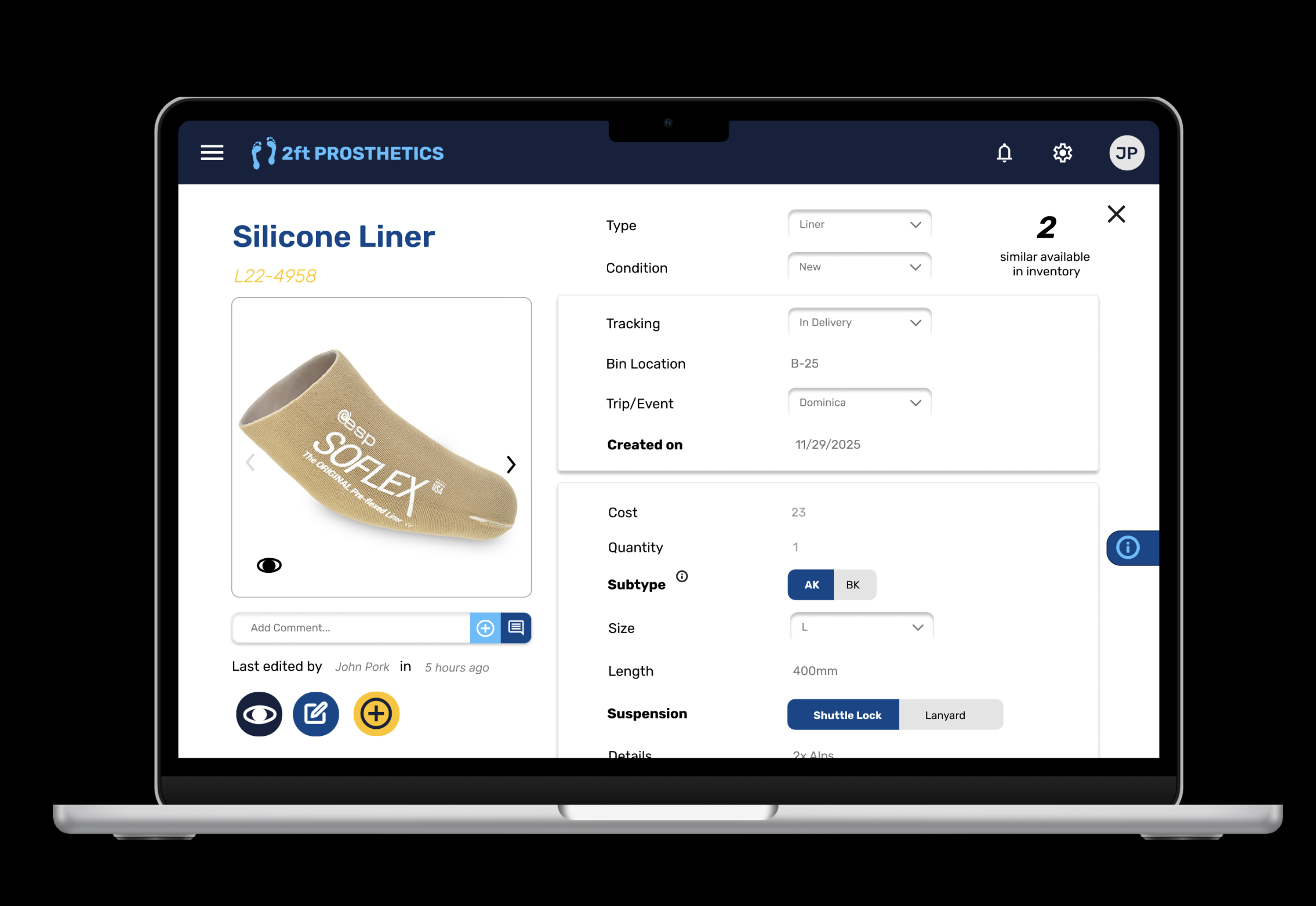
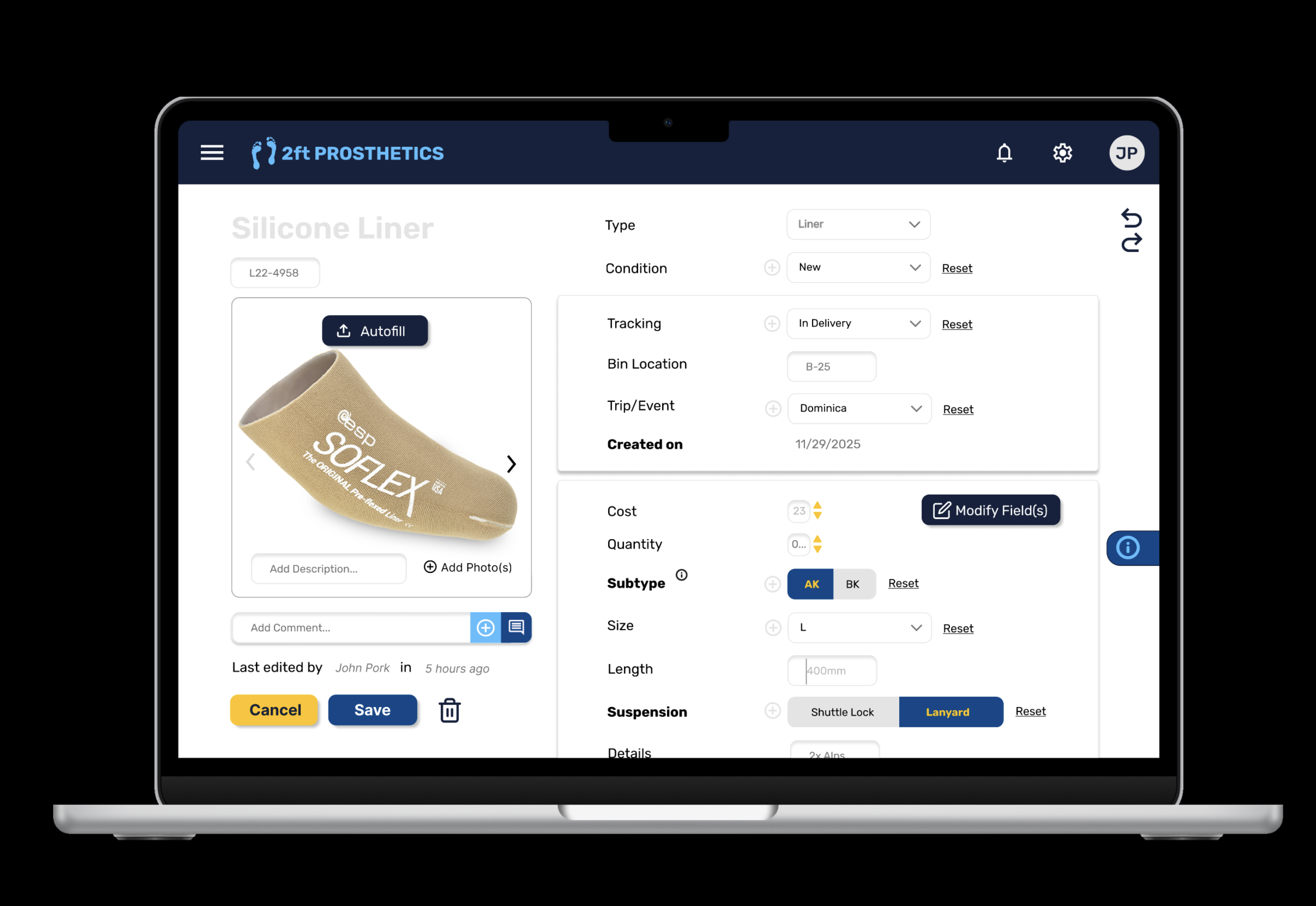
The blue/yellow design introduced structure without noise: clear separation between logistics → technical → manufacturer details, collapsible sections, inline edit popups, and visible history for trust.

Placeholder: Hi-fi view component (blue/yellow) Placeholder: Hi-fi edit component inline popup (blue/yellow) Placeholder: Hi-fi history/comments (blue/yellow)

(1) View component, (2) Edit Component, (3) Add Component

Testing & Feedback

Where the Design Got Smarter (Fast)

More speed with less typing: ideas like autofill, stock image autofill (when no photo exists), and even adding fields on the fly came up as ways to reduce friction.

What stakeholders pushed us toward

A reality check on implementation: we flagged open questions about the backend — like whether field management needs its own admin page, and what “autofill” would actually pull from (model number? manufacturer database? past entries?).

Type-first workflow was a win: starting from component types (since each type has its own properties) felt far more natural than exposing every possible spreadsheet field and forcing volunteers to guess.

The biggest validation came from a single sentence:
“I don’t feel like I’m going to break anything.”

Try It Yourself

Explore the prototype the way a volunteer would

This interactive prototype reflects the hi-fi design shown above. It’s best experienced by clicking through the component workflow, starting from type selection and moving into detailed edits.

Open Interactive Prototype →

Tip: Try editing a component to see how fields, history, and permissions are surfaced.

Permissions matter: stakeholders emphasized that changing fields can cause organization-wide mixups, so we needed clearer role-based privileges (e.g., who can edit fields vs. who can only edit values).

Reflection

What This Project Taught Me

This is my first exposure to UX Design, so there were many new frameworks and mindsets to internalize. Designing for social impact isn’t about adding features. It’s about removing uncertainty as much as possible and box everything together.

As this is a work from scratch, we did experiment a lot with different flows and structures in an entirely new field of expertise. The biggest challenge was balancing complexity (lots of fields, edge cases, offline states) with usability (clear flows, low cognitive load, fast entry).