Ongoing | CS 1710 · Final Project: Visualization
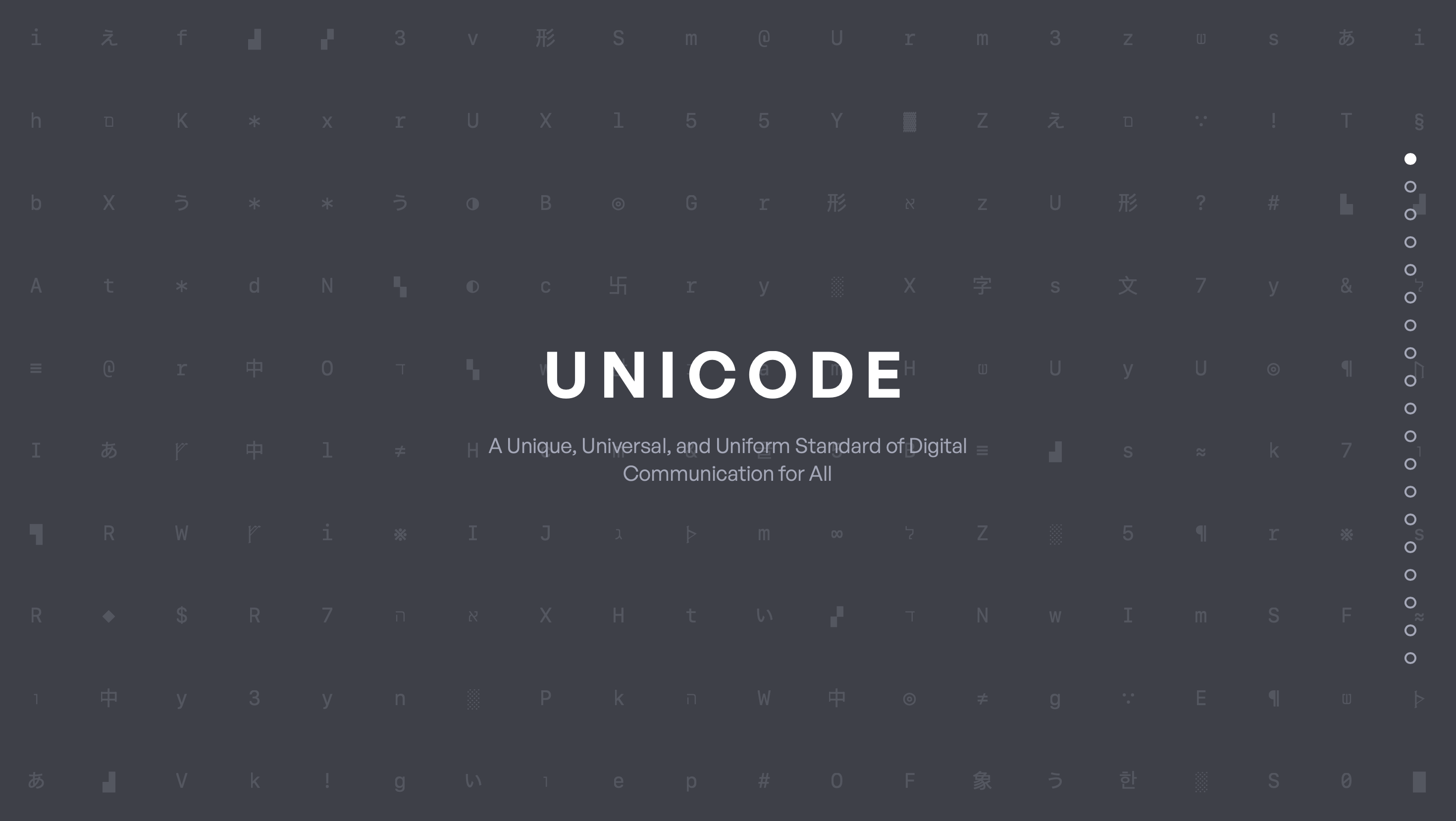
The Story of Unicode
A scrollytelling website that turns “invisible infrastructure” into an interactive narrative: ASCII → Unicode → emoji → writing systems.
TL;DR
• Built a data story from scratch and converged from broad typography ideas into a clear Unicode narrative for non-technical audiences.
• Designed each section around a “learn by exploring” interaction (filters, hover details, timelines, and guided views).
• Testing showed the biggest UX risks were terminology + cognitive load, so we simplified copy, standardized UI patterns, and added micro-definitions/tooltips.
Goals & Success Criteria
• A non-technical reader can see the pattern of evolution quickly
• Each section teaches clear idea in primary interactions (no wall of text).
• Users can move through the story without getting stuck on labels or navigation.
Context
Unicode is everywhere—so why does it feel invisible?
Unicode is the standard that allows text, symbols, and emoji to display consistently across devices and platforms. Because it’s “always on,” most people never think about it—until something breaks or a character can’t be represented.
Our project goal was to make Unicode legible and interesting through a narrative that people can explore without prior knowledge.
Design Challenge
How do you visualize a technical standard without losing people?
The hard part wasn’t only the data—it was the UX: terminology, pacing, and motivation. If the story felt too technical, users would bounce. If it was too simplified, it would feel shallow.
We designed for clarity-first onboarding, low-friction exploration, and a consistent interaction language across sections.
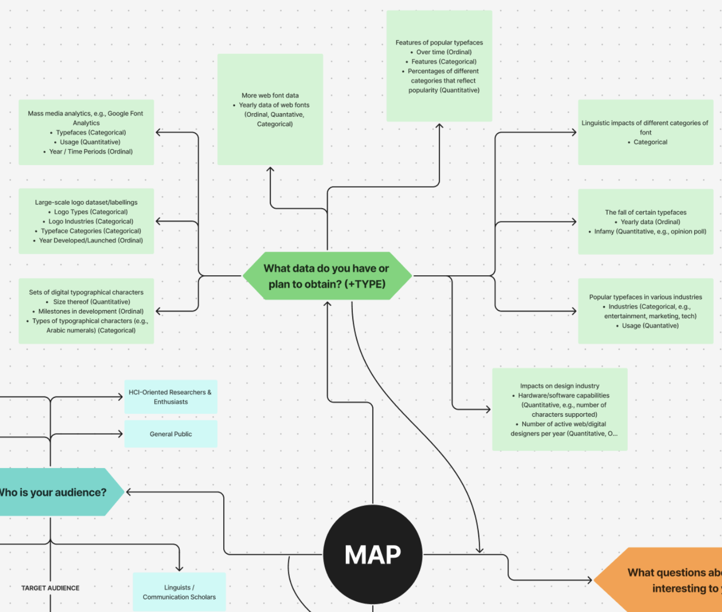
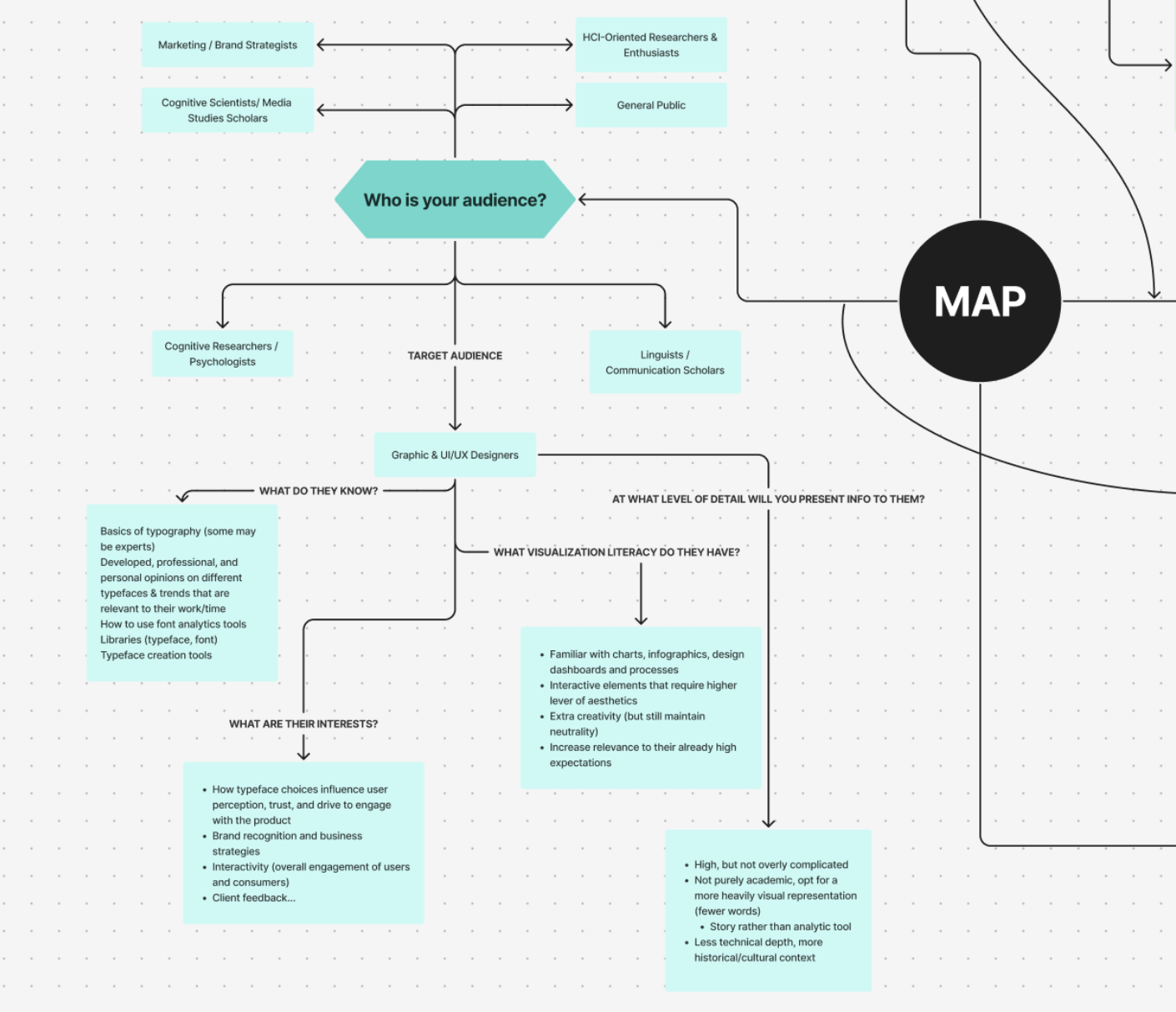
Exploration
Starting from scratch meant testing the question before the interface
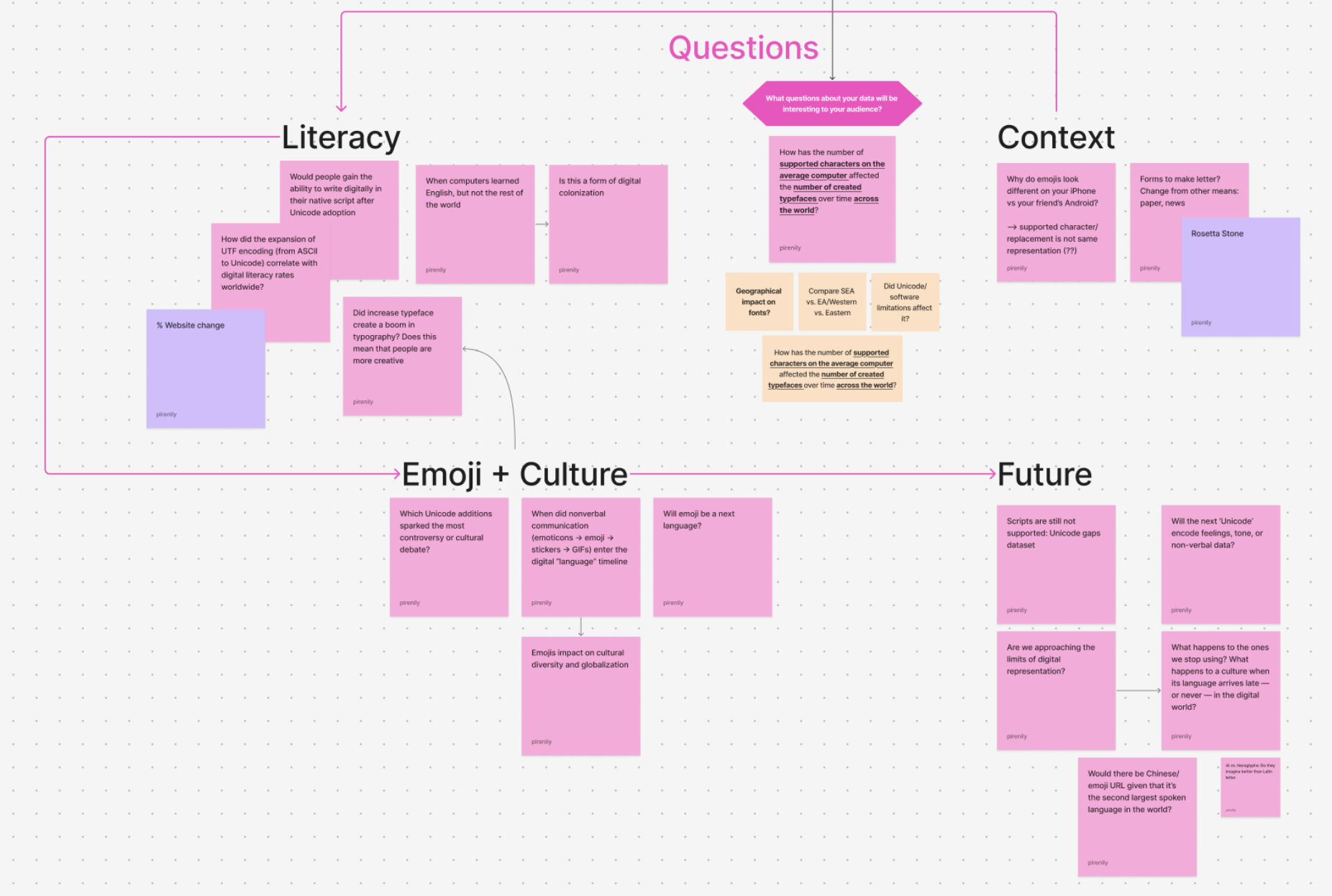
We began with wide exploration—possible audiences, datasets, and story angles. Early concepts leaned toward typography and fonts, but we kept asking what a general reader would actually want to learn and explore.
The exploration phase helped us identify which ideas were “cool” versus which ones could become a coherent narrative experience.
Convergence
We narrowed to Unicode to create clearer stakes and stronger interactions
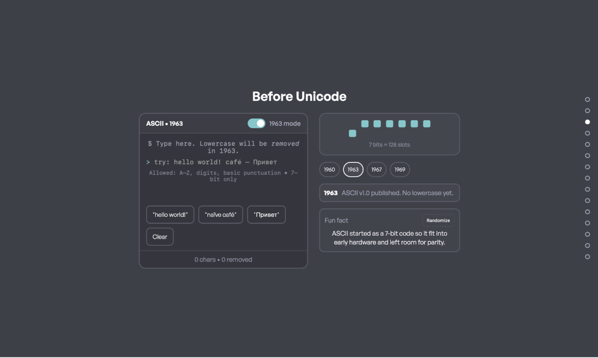
Unicode gave us a strong arc (ASCII → Unicode → emoji → writing systems) and a built-in reason to care: representation and interoperability.
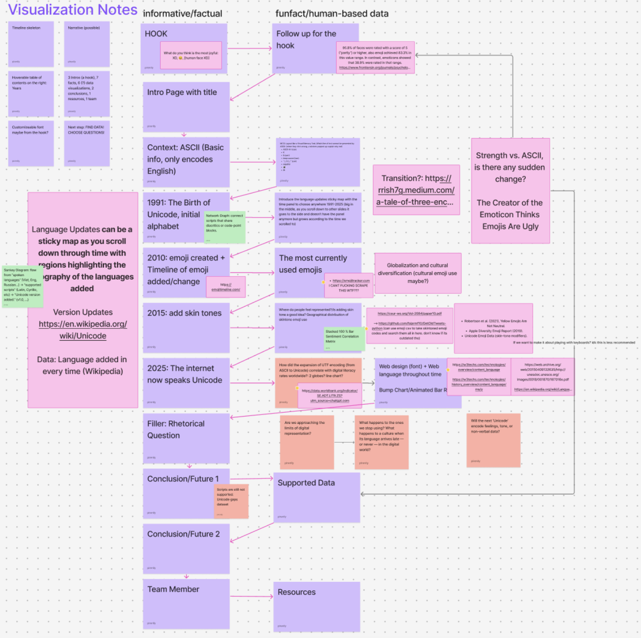
The storyboard let us plan pacing and “interaction beats” so users would learn by doing, not just reading.
Research
Translating technical history into usable story units
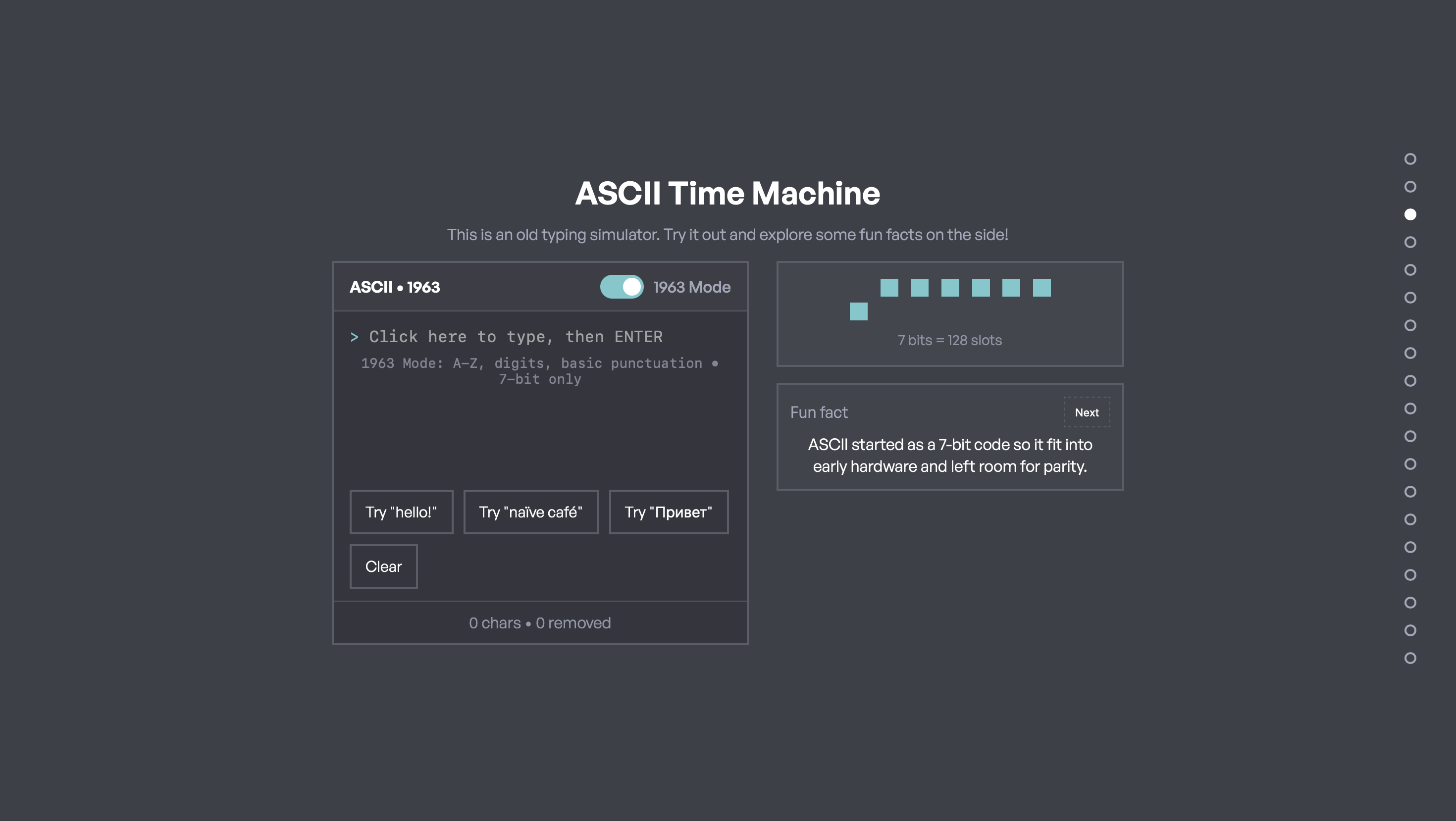
We collected sources and datasets around ASCII limitations, Unicode growth, emoji adoption, and the diversity of writing systems. Then we translated that research into sections with clear takeaways and lightweight interactions.
Our guiding rule: if we can’t explain a concept in one sentence, we need a better label, a better visual, or both.
My Contribution
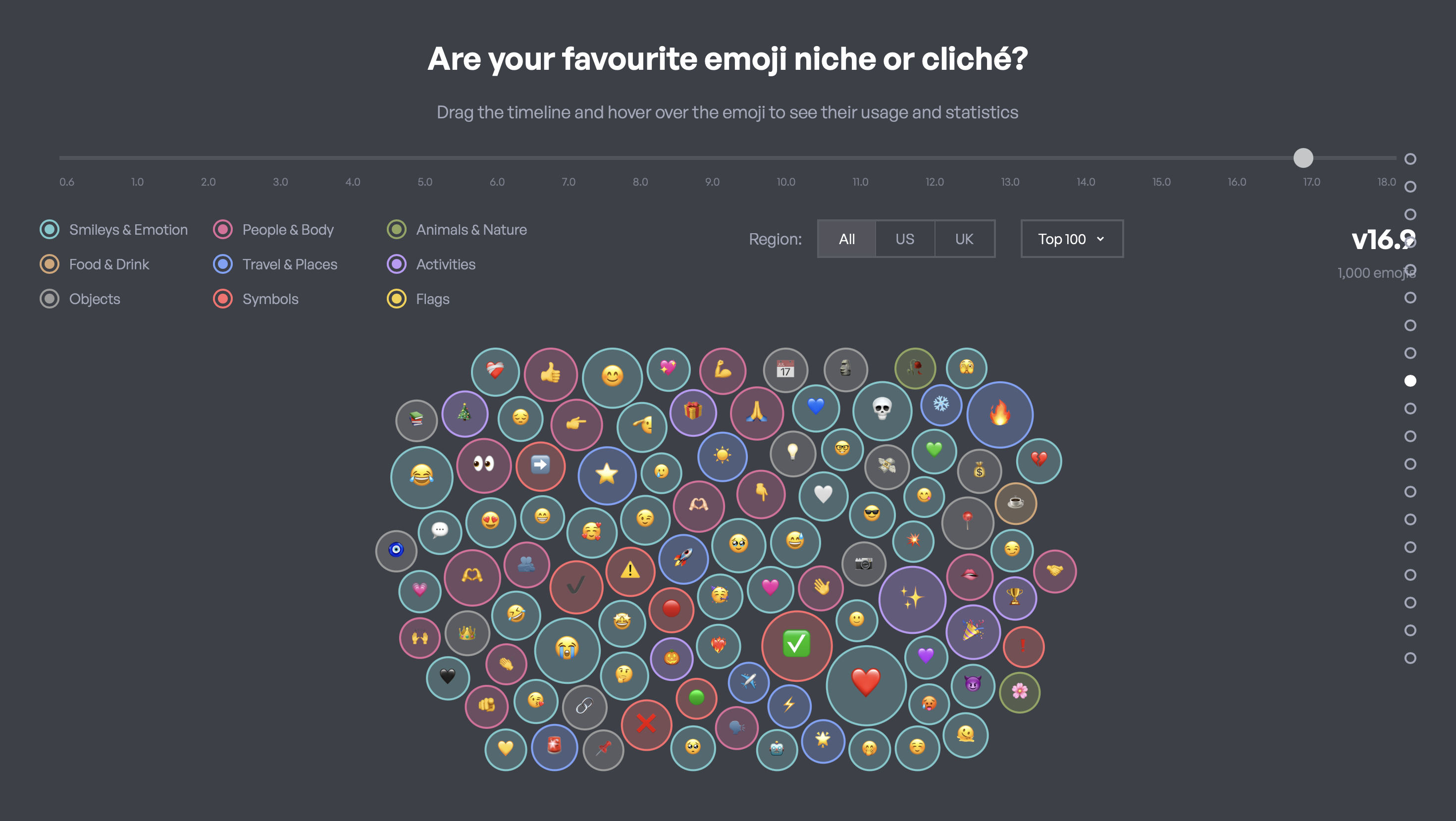
Game / Emoji / Interactions
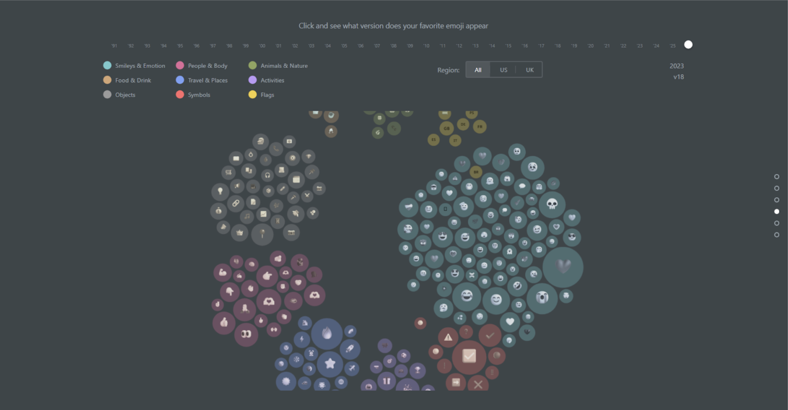
I owned the end-to-end flow for how users can interact with the data more playfully, mainly on Game Design / Quiz aspects and datasets on Emoji.
Design decisions I focused on:
— Clean and easy interactions/instructions for legends and filters
— Prevent accidental edits (inline popups, clear save states)
— Hooks to keep users engaged (fun wordplays, lessened word count)
— Animations to guide attention (hover states, transitions)
Design Principles
• Define jargon in context (micro-definitions, tooltips, examples).
• One main interaction per section (reduce cognitive load).
• Reuse UI patterns (filters, toggles, hover details) so users don’t relearn controls.
Prototyping
We prototyped early to find what “clicks”
We created quick prototypes to validate both narrative flow and interaction design. The focus was less “pixel perfect” and more: can a user understand what to do next, and does the interaction teach something?
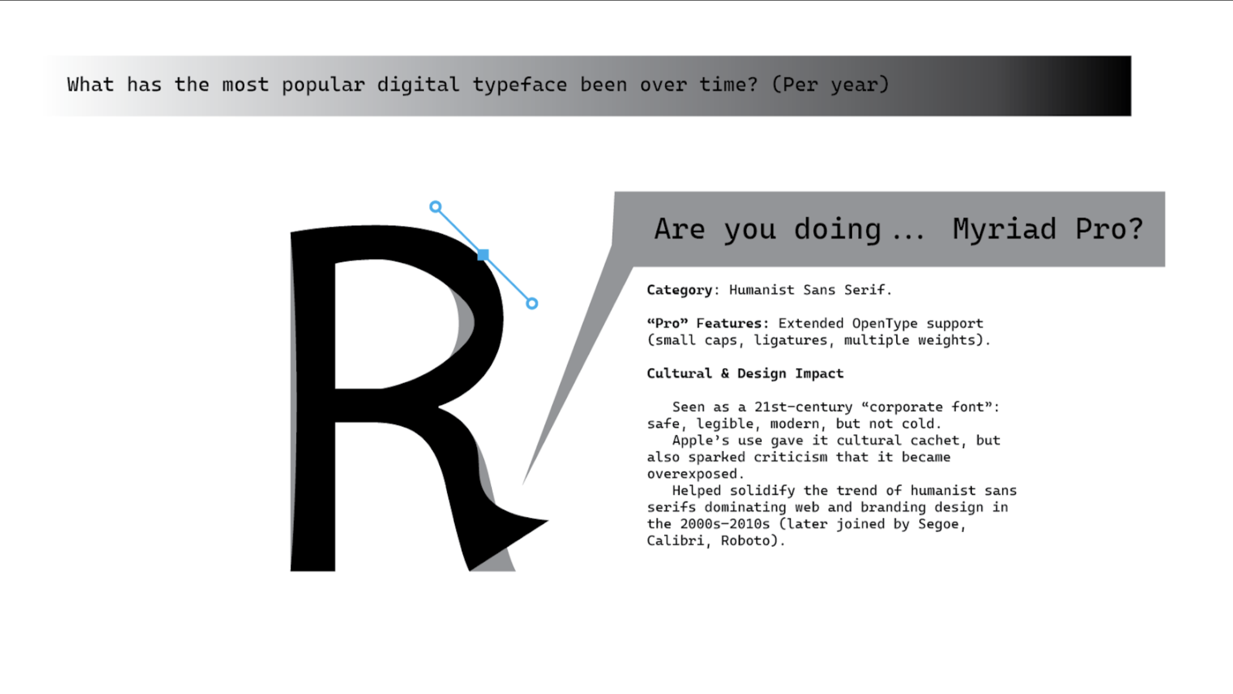
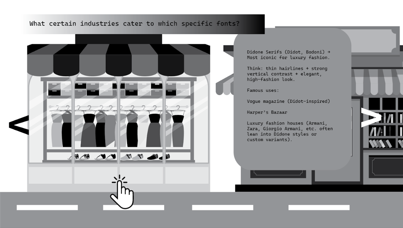
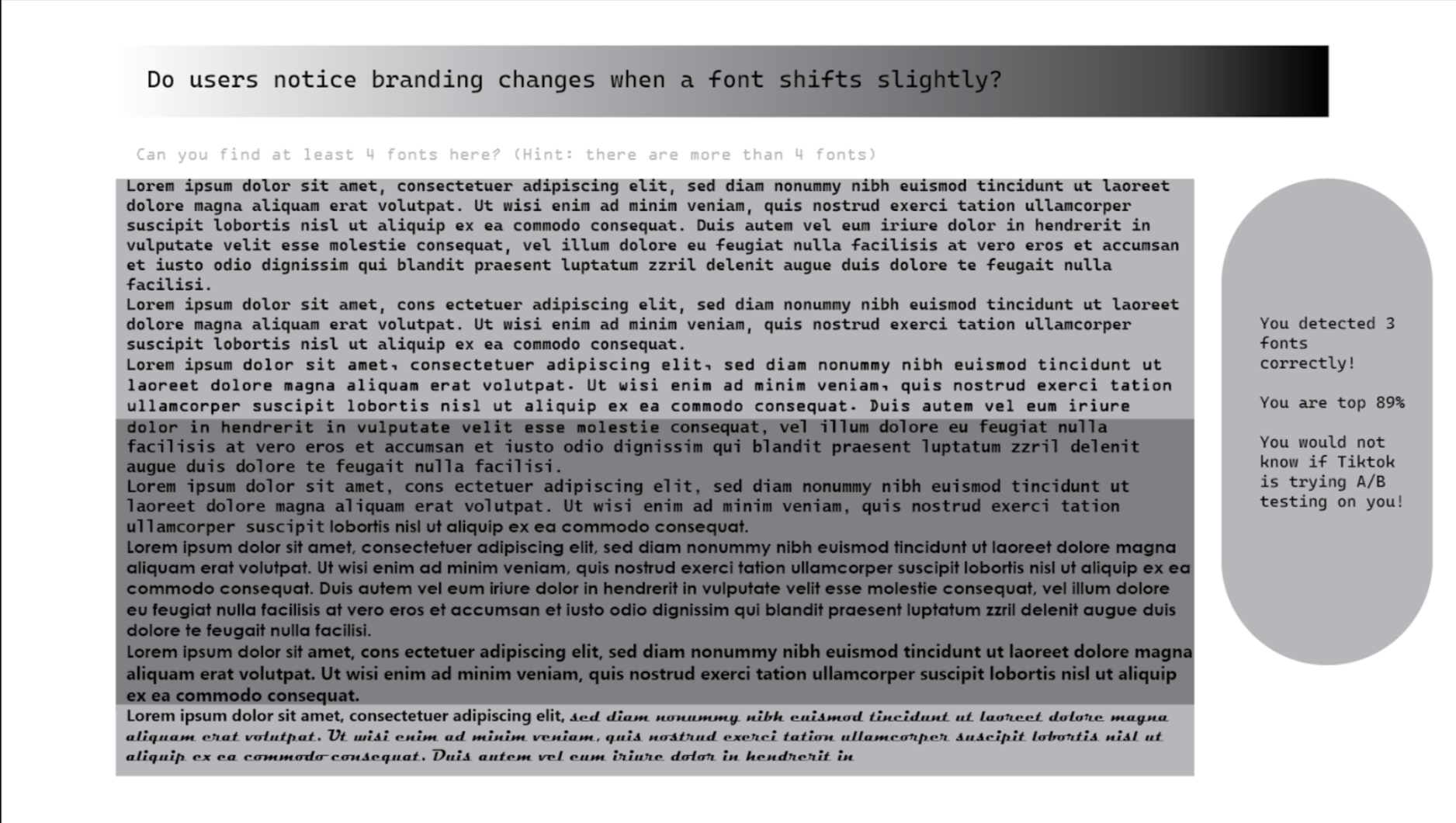
Possible games included quizzes and sorting challenges to reinforce key concepts.
These snapshots show our iteration focus: consistent controls, clearer labels, and interactions that teach one idea at a time.
Testing & Iteration
Think-aloud sessions helped us reduce friction fast
We ran think-aloud testing to see where users hesitated, misunderstood labels, or lost the story thread. The most common issue wasn’t “the data is too hard”—it was UI clarity: what does this control do, what does this term mean, and why is this section here?
What we observed
• Users skimmed long paragraphs and missed key definitions.
• Some terms felt technical without examples.
• When sections changed interaction styles, users slowed down.
What we changed
• Shorter copy + stronger headings per section.
• Micro-definitions/tooltips near charts.
• Standardized controls (filters/toggles/hover details) across views.
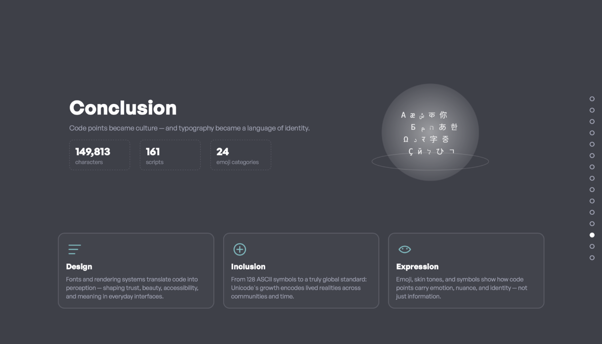
Outcome
A narrative that makes infrastructure feel personal
The final story guides users from a familiar starting point (ASCII constraints) into scale (Unicode growth), culture (emoji), and representation (writing systems). The goal is for users to leave with a clearer mental model: Unicode isn’t just “code”—it shapes what can be expressed digitally.
Try It
Explore the site
Explore our Github! You can just Open with Live Server in VS Code to see the interactive prototype in action.
Open the live project →Reflection
What I’d improve next
Next iteration, I’d strengthen onboarding even further: a short guided “tour,” clearer transitions that explain why each section matters, and more progressive disclosure (show basics first, advanced controls second) to keep first-time users confident.
I also want to focus more on accessibility: ensuring all interactive elements are keyboard navigable, animations respect user preferences, and color choices meet contrast standards.