
T4SG × CommonSpirit Health
A UX case study on redesigning CommonSpirit Health's internal Community Health Needs Assessment (CHNA) analysis tool.
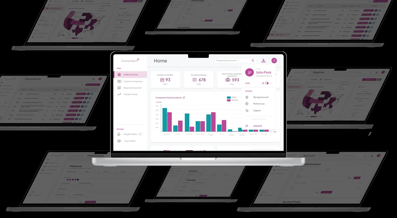
TL;DR
• CIP staff had to manually read through 50–60 CHNA PDFs a year and dig through a cluttered, color-dense dashboard just to compare health priorities across hospitals, regions, and time.
• The legacy tool leaned on dense color-coding and text-heavy outputs that staff described as "overwhelming," and it got noticeably less useful in the years between CHNA updates.
• I helped rebuild the system around four focused pages (Home, Regional, Compare, Trends) with CommonSpirit's own brand palette, and owned the Account/Settings experience end-to-end.
Context
A health-equity investment tool that had outgrown its own interface
CommonSpirit Health is the largest nonprofit health system in the U.S., reaching more than 20 million patients a year across 2,300+ clinics and 138 hospitals in 24 states. Its Community Investment Program (CIP) puts capital — mostly below-market-rate loans — into organizations addressing the social determinants of health in the communities CommonSpirit serves. Working with the CIP team through Tech for Social Good (T4SG), I joined a 12-week project to improve the internal tool CIP staff use to analyze community health needs assessment data — the evidence base behind where and how the program invests.
A previous T4SG team had built the tool the year before, and while it worked, it hadn't kept pace with how CIP staff actually needed to use it. Staff wanted to upload and manage data, cross-tabulate results, and compare health indicators across time, sector, and geography — but the tool offered no reporting dashboards, no way to surface correlations between data points, and little room to add context around the numbers. That gap made it hard to turn raw needs-assessment data into the kind of clear, comparative insight CIP staff needed to prioritize investments across 200+ communities.
Ideation
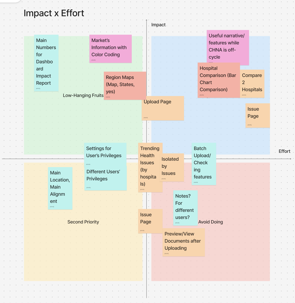
Interview notes from board members and CIP staff kept surfacing the same tension: the tool needed to support quick, visual comparisons across hospitals, regions, and time without turning into another wall of text. We ran an impact-vs-effort pass on every feature idea that came out of research — main KPI numbers, region maps, hospital comparison charts, batch upload, notes, and more — and used it to decide what shipped first, and what we'd explicitly avoid building for now.
From there, we scoped the product down to four pages: Home for the top-line KPIs staff check first, Regional because so many priorities turned out to be shared well beyond a single city or market, Compare because comparing hospitals was the CIP team's original ask, and Trends because trend data over time was consistently the most-praised part of the legacy tool for what's fundamentally an internal analytics product.
We also iterated on where the navbar lived — the legacy top nav didn't leave room for four sections plus settings, so we moved it into a persistent left sidebar — and swapped in CommonSpirit's own brand palette instead of a generic dashboard theme, so the tool would read as unmistakably "CommonSpirit" to the staff and board members using it.
My contribution
My part of this was the system design and the Account/Settings experience shown below. The legacy settings page was a single dark-mode screen with a username, email, and bio field. I rebuilt it into a proper Account + Preferences flow: structured profile fields with role and avatar, a Security & Privacy section (password, 2FA, data export), and a Preferences page that lets staff set defaults for chart color mode, contrast, sorting, default document sets, and geography level — so the visualizations they see first match how they actually work.
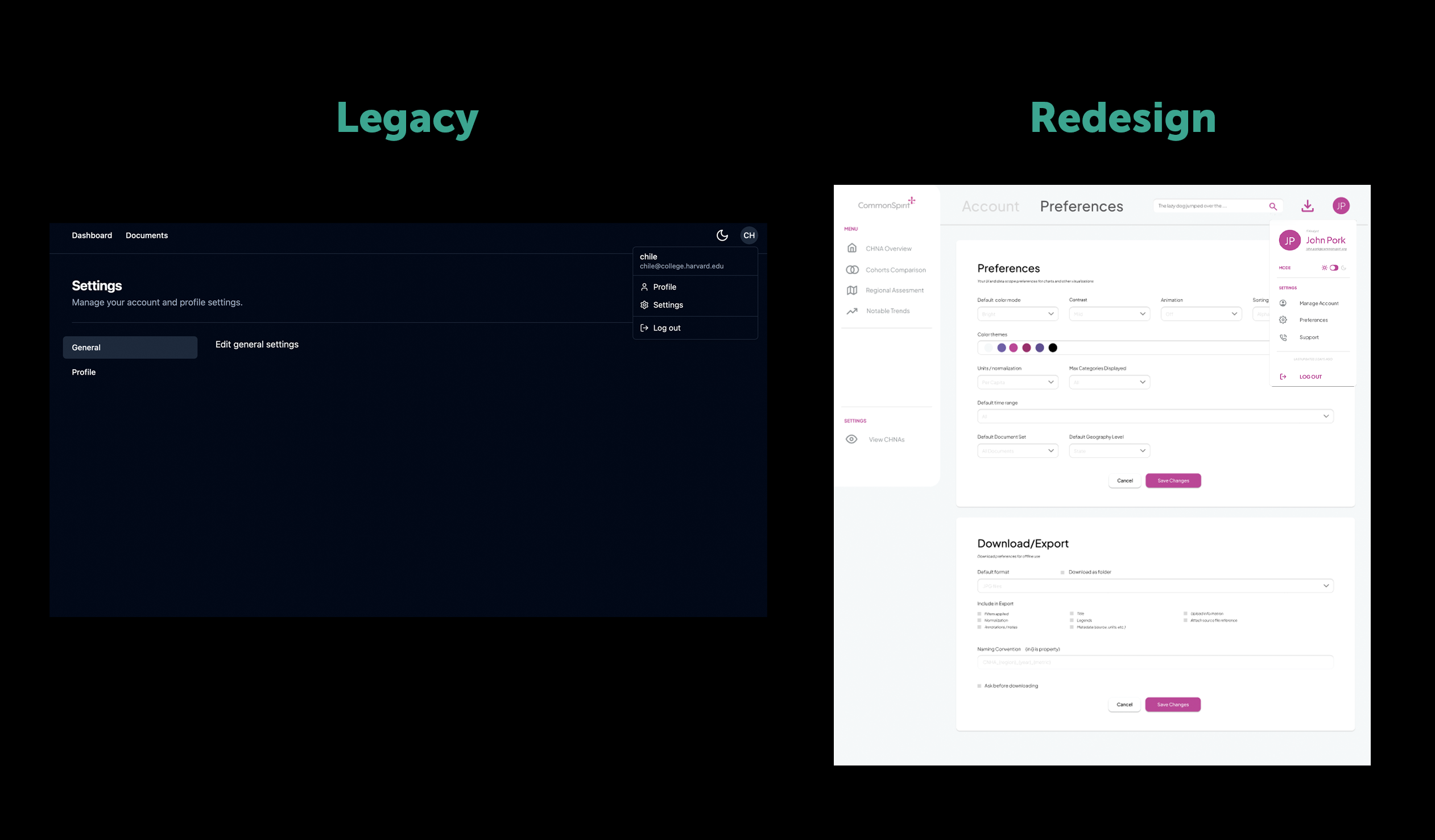
Preferences — renamed from "General," since the page had grown into advanced settings (chart color mode, contrast, sorting, default document sets, geography level) that "General" undersold.
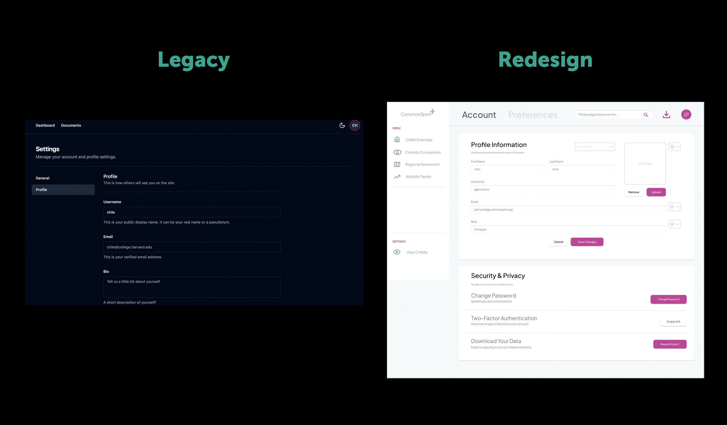
Account — accessible directly from the profile card, which is why it's the first settings screen staff land on.
Reflection
Palette and IA decisions carry more weight in an internal tool
The biggest lesson was that for an internal, repeat-use tool, small system decisions — where the nav lives, how many clicks to a comparison chart, whether the palette feels "theirs" — matter as much as any individual screen. Leaning on CommonSpirit's own palette made the tool feel adopted rather than imposed by an outside team.
It's also the choice I'd want to pressure-test next: a palette built mostly around CommonSpirit's magenta is a bold accessibility bet for a data-dense internal tool, especially since the comparison charts already lean on color coding to separate series. Next time, I'd check contrast ratios and colorblind-safe alternatives before rolling a brand palette this saturated into the actual data visualizations, not just the chrome around them.